How to Make Your Website Responsive for the iPhone Duo (Apple's First Foldable)
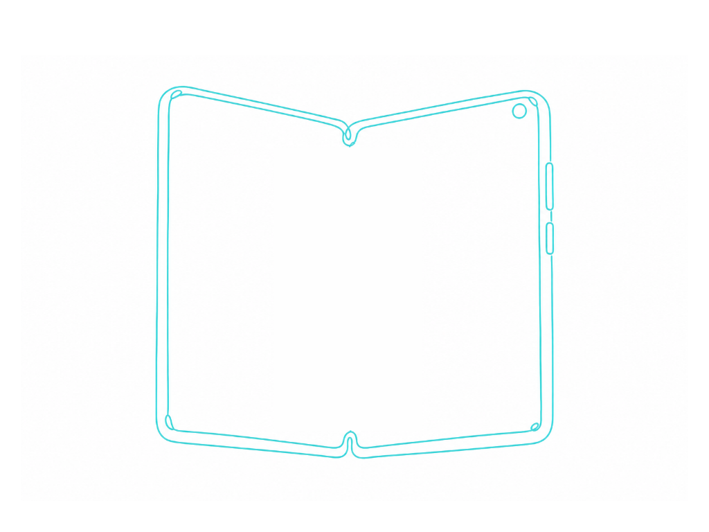
Apple's first foldable iPhone doesn't have one screen. It has two, a 5.4-inch outer display and a 7.6-inch inner display, and your visitors will be switching between them constantly, often mid-session. If your site only accounts for one, it's going to look broken the moment someone unfolds their phone while browsing.
This isn't a hypothetical edge case anymore. The iPhone Duo shipped with real numbers: a 1398 × 2034 pixel outer display and a 1878 × 2670 pixel inner display, both OLED. That's not a small phone and a slightly bigger phone, that's a genuine jump in available screen real estate on the same device, in the middle of the same browsing session.
The detail most people will miss
Here's what actually matters for responsive design, and it's easy to overlook.
Apple built both displays to share the same aspect ratio. That's not an accident, it means content is designed to scale proportionally between the two screens rather than needing an entirely different layout logic for each one.
That's genuinely good news for web design, if you build your site with proportional, fluid layouts instead of fixed pixel breakpoints, you're already halfway to handling this correctly. Sites built on rigid, fixed-width containers are the ones that are going to break.
Why "just add a breakpoint" isn't the full answer
The instinct is going to be to add a media query targeting the iPhone Duo's specific resolution and call it done. That's a trap. Foldables don't just resize, they change orientation and aspect ratio the moment someone opens or closes the device. A visitor could load your site closed, unfold it mid-scroll, and expect the layout to adjust smoothly in real time, not require a page reload to look correct.
Design for this the way you'd design for any modern responsive site, with fluid grids, relative units, and flexible images, rather than a laundry list of device-specific breakpoints. The moment you're hard-coding a fix for "the iPhone Duo specifically," you're solving today's problem and setting up tomorrow's, because the next foldable device that ships won't match your hard-coded numbers either.
What to actually test
Both screen states, don't just check your site on the outer display and assume the inner display will "just scale." Open the device fully in your testing and check whether images, navigation, and text all still make sense with the extra width.
The transition itself, resize your browser window slowly rather than just checking two fixed sizes. If your layout stutters, jumps, or breaks mid-resize, that's exactly what a user folding or unfolding their phone will experience live.
Touch targets on the smaller outer display, at 5.4 inches, this is a genuinely small screen. Buttons and links that felt fine on a standard iPhone can feel cramped here if your design wasn't already mobile-first.
Aspect-ratio-based media queries, alongside standard width-based ones, since Apple explicitly designed around consistent aspect ratio, not just consistent width.
Why this matters for SEO, not just aesthetics
Google's mobile-first indexing means the mobile experience of your site is the version that gets evaluated for ranking. A layout that breaks or requires horizontal scrolling on a widely-covered new device is a real user experience signal, and user experience signals increasingly matter for how both traditional search and AI-powered search evaluate a site's quality and trustworthiness.
A site that looks unprofessional or broken on a device this widely discussed isn't just an aesthetic problem. It's a credibility problem, at exactly the moment a lot of people are likely to be testing it out of curiosity.
The actual takeaway
You don't need a special "iPhone Duo strategy." You need a genuinely fluid, proportionally-scaling responsive design, the kind that was always the right way to build a website, and foldable devices just raised the stakes on skipping that step. If your site already flexes cleanly across arbitrary screen sizes rather than jumping between a fixed set of breakpoints, you're already covered. If it doesn't, this is as good a reason as any to fix it now, before more foldable devices make rigid, breakpoint-only design look increasingly outdated.