Free Tool to Preview Your Website on the iPhone Duo Before It Launches
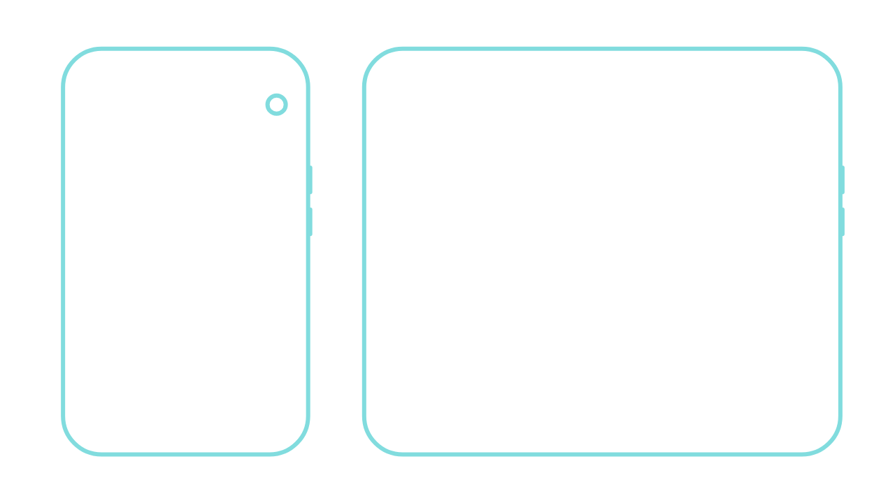
The iPhone Duo is going to fold your website in half, literally. A page that looks perfect on a normal phone screen can end up cramped, stretched, or just plain awkward once that screen unfolds into something almost square. Most businesses won't know how their site holds up until real customers are already looking at it on the device.
We built a free tool to fix that. You can preview any website, yours or a competitor's, on a folded and unfolded iPhone Duo right now, months before the phone is even in anyone's hands.
Link to iPhone Duo screen tester tool.
What the tool does
Enter a URL, and the tool loads that website inside an iPhone Duo mockup. Drag the slider and watch it fold and unfold in real time, from the narrow 5.4-inch cover screen to the wide 7.6-inch inner display. You get an instant, visual read on how your layout behaves across both screen states, without opening a single line of code.
It's built for website owners, designers, developers, and marketing teams who want a fast gut-check before a foldable device shows up in their analytics.
How it actually works
Most sites load live inside the mockup through an iframe, so what you see is the real, working site, not a mockup or a guess. Some websites block that kind of embedding for security reasons. When that happens, the tool falls back to a screenshot instead, so you still get a visual sense of the layout even if it's not fully live.
To be straight with you: this isn't a pixel-perfect simulator yet. The iPhone Duo hasn't shipped, so nobody has been able to test against the real hardware. What you're seeing is our best current approximation of the screen sizes and resolutions Apple has shared. Once the device actually launches and we can test on a real unit, we'll update the tool to match it exactly.
Why check this before launch
Foldable phones aren't just a bigger screen, they're a different shape entirely. The inner display is nearly square, which is a layout your site has probably never had to handle. A few things worth checking before real visitors run into them:
Headlines and hero text that wrap oddly once the screen widens
Navigation menus that feel cramped on the cover screen or oddly spaced out once unfolded
Images and banners built for a tall, narrow phone that look stretched or cropped on a wide, square screen
Buttons and forms with spacing that only works at one aspect ratio
Layouts that read fine folded but feel unbalanced the moment the screen opens up
Catching these now costs you five minutes. Catching them after launch costs you customers who bounce before they even see what you're selling.
A quick first check, not a full replacement
This tool gives you a fast visual read, and that's exactly what it's meant to do. It won't replace testing on an actual device once you have one in hand. Real hardware brings real browser behavior, real touch response, and real performance, none of which a browser-based mockup can fully capture. Use this to catch the obvious problems early, then confirm everything on a real device once you can.
How to use it
Open the tool, paste in your website's URL, and it loads instantly inside the phone frame. Scroll and watch your layout adjust in real time. It's free to use, no account or sign-up required, and it works just as well after the iPhone Duo launches as it does now. As the real device rolls out and screen behavior becomes clearer, we'll keep refining the tool to match.
About Aicceleration
We're a creative and AI studio building websites that convert and are easy for your team to update without calling a developer every time. Beyond web design, we handle branding and creative direction, and we help businesses show up when people ask AI tools like ChatGPT and Gemini for recommendations, not just when they type into Google.